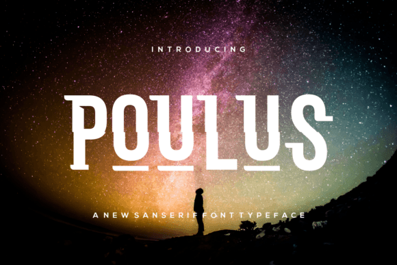
Poulus: A Contemporary Display Font for Digital Design
As a UI designer who ships dozens of landing pages, SaaS dashboards, and e-commerce experiences each year, I pay close attention to how typefaces behave—not just how they look. Poulus stands out precisely because it delivers strong visual impact without sacrificing digital legibility or layout control. It’s not a script font, nor a serif—it’s a tightly crafted display font with clean geometry, subtle personality, and confident spacing that translates beautifully across screens.
Visually, Poulus balances modern minimalism with expressive character. Its letterforms feature soft but deliberate contrast, open counters, and consistent stroke rhythm—traits that support fast scanning on mobile and desktop alike. Unlike many decorative display fonts, Poulus avoids excessive flair or distortion. That means it holds up in hero sections at 48px on retina displays, remains crisp in SVG-based logo lockups, and stays readable when overlaid on textured backgrounds or gradient image banners.
In practice, I reach for Poulus when I need to establish tone *immediately*. It works exceptionally well in headline roles: hero titles, section headers, course module labels, and CTA buttons where brevity and brand clarity matter most. For example, a boutique online store selling handmade ceramics uses Poulus for its “New Arrivals” banner—paired with Inter for body copy—and the contrast reinforces craftsmanship and calm confidence. Similarly, a coaching website deploys Poulus in its “Book Your Session” button: short, bold, human—but never playful to the point of undermining authority.
Readability on small screens is where many display fonts falter. Poulus handles responsive scaling gracefully. At 24–32px on mobile, it retains shape integrity without crowding. I avoid using it below 20px—even for subheadings—because its design intent is emphasis, not utility. For accessibility and scanning behavior, I always pair Poulus with a highly legible sans serif like Inter, Manrope, or IBM Plex Sans. These pairings create clear visual hierarchy: Poulus sets the voice; the companion font carries the message.
For dark mode interfaces, Poulus performs reliably against deep charcoal or navy backgrounds—its generous x-height and open apertures prevent visual “sinking.” On light backgrounds, it benefits from subtle letter-spacing adjustments (0.5–1px) in CSS to maintain rhythm, especially in all-caps usage. When placed over imagery, I apply a soft text shadow or background tint only when necessary—Poulus rarely needs heavy treatment to remain distinct.
Font pairing isn’t theoretical—it’s functional. In editorial web experiences, I’ve paired Poulus with a warm serif like EB Garamond for blog headers, letting the serif handle long-form readability while Poulus anchors thematic sections. For digital ads and social graphics, it pairs cleanly with geometric sans serifs like Urbanist or Rubik, supporting cohesive brand kits across platforms. Its neutral-yet-characterful tone makes it equally at home in a fintech dashboard header or a wellness app’s onboarding flow.
Poulus is built for real-world web use. It ships in WOFF2 format—optimized for fast loading—and includes standard Latin character sets with robust diacritic support for English, Spanish, French, German, and Portuguese. While it doesn’t include extended Cyrillic or Arabic glyphs, its coverage suits most global-facing SaaS products, blogs, and online stores targeting Western markets. No stylistic alternates or variable axes are included, which keeps implementation simple: one weight, one purpose, zero configuration overhead.
I use Poulus most often in these high-impact scenarios:
- Landing page heroes — Where first impressions drive conversion, Poulus adds distinction without distraction.
- Product feature cards — Its clean structure helps users parse benefit-driven headlines quickly.
- Course or membership sales pages — Titles like “Level Up Your Skills” or “Join the Community” gain warmth and approachability.
- Portfolio site section dividers — Used sparingly as a typographic accent, it signals transitions without competing with work samples.
- Branded email headers and digital newsletters — Renders consistently across clients when embedded as web-safe fallbacks or inline SVG.
Licensing is straightforward—and critical to get right. Poulus is a commercial font, meaning it requires a license for any public-facing digital use: websites, client projects, online stores, marketing templates, or downloadable brand assets. The standard license covers unlimited domains and projects under a single business entity, with no per-page or impression fees. For agencies or studios managing multiple client sites, an extended license ensures full compliance across deliverables—including Figma files, Notion brand kits, and Shopify theme packages.
What sets Poulus apart isn’t novelty—it’s reliability. In a landscape crowded with ultra-thin, ultra-bold, or overly stylized display fonts, Poulus offers something rarer: consistency across contexts. It doesn’t shout. It doesn’t whisper. It states—clearly, calmly, and confidently. That makes it ideal for designers building digital products where trust, clarity, and brand cohesion aren’t optional extras—they’re foundational.
If you’re selecting a display font for your next web project, ask yourself: Does it support hierarchy without complicating layout? Does it scale predictably across devices? Does it reflect brand tone without demanding attention away from content? Poulus answers yes—to all three.